Chart Title
Chart Settings
Color Palette
Create beautiful pie charts with custom colors, labels, and percentages

Founder & CEO, Toolraxy
Faiq Ur Rahman is a web designer, digital product developer, and founder of Toolraxy, a growing platform of web-based calculators and utility tools. He specializes in building structured, user-friendly tools focused on health, finance, productivity, and everyday problem-solving.
User Ratings:
The Pie Chart Creator is a free online tool that lets you design, customize, and export professional-looking pie charts instantly. Whether you need to visualize budget allocations, market share, survey results, or any proportional data, this tool provides complete control over your chart’s appearance and content. Business professionals, students, data analysts, and educators use this creator to transform raw numbers into visually compelling pie charts with custom labels, colors, and percentages. Add or remove slices, adjust border width, choose from multiple color schemes, and export your finished chart as a high-quality PNG image—all without installing any software.
Follow these steps to create and customize your pie chart:
Set Number of Slices: Use the slider to adjust the number of slices (3–12) in your chart.
Adjust Border Width: Control the thickness of the white borders between slices (0–10px).
Choose Legend Position: Select where to display the legend—Top, Right (default), Bottom, Left, or None.
Select Chart Type: Choose from Pie Chart (default), Doughnut Chart (hole in center), or Polar Area Chart.
Set Animation Speed: Pick Normal, Slow, Fast, or No Animation for chart rendering.
Choose Color Scheme: Select from Default, Bright, Pastel, Warm, or Cool color palettes.
Enter Chart Title: Type a descriptive title that appears above your chart.
Edit Slice Labels and Values: In the Chart Data section, click any label or value input field to modify them. Values must be positive numbers.
Apply Changes: Click the “Apply Changes” button for each slice or use the “Update Chart Preview” button to refresh the entire chart.
Add or Randomize Slices: Use “Add Slice” to increase chart size or “Randomize Data” to generate sample values.
Export Your Chart: Click “Export as PNG” for a high-quality image, or “Export Data” to download as CSV.
Save and Load: Use “Save Preset” to store your configuration locally, and “Load Preset” to retrieve it later.
The Pie Chart Creator uses Chart.js, a powerful JavaScript library, to render interactive charts in real-time based on your configuration settings. Here’s the underlying logic:
Data Structure: All chart information is stored in a JavaScript array called sliceData containing objects with:
label: The category name for each slice
value: The numeric value determining slice size
color: The slice color in hex format
Chart Rendering: When you update the chart, the tool:
Extracts labels and values from sliceData
Calculates percentages automatically (each value / total × 100)
Applies your selected color scheme or individual slice colors
Creates a new Chart.js instance with your chosen chart type
Configures legend position and border width
Sets animation duration based on your preference
Percentage Calculation: The tool continuously calculates percentages in real-time:
Total = Sum of all slice values
Slice Percentage = (Slice Value ÷ Total) × 100
Percentages update instantly when values change and always sum to 100%.
Color Management: Color schemes apply predefined color arrays to slices. Individual slice colors can be customized using the color picker inputs that appear below the color scheme selector.
Real-Time Editing: When you modify a label or value input:
Changes are tracked with a pending state
After 2 seconds of inactivity, changes auto-apply
Manual “Apply Changes” buttons provide immediate updates
The chart refreshes with new data
Pie Chart: Standard circular chart divided into slices showing proportional data. Each slice represents a percentage of the whole.
Doughnut Chart: Similar to a pie chart but with a hole in the center. The hollow center can be used for additional information or creates a modern visual effect.
Polar Area Chart: Circular chart where each slice has equal angles but different radii based on values. Useful for comparing magnitudes across categories while maintaining circular form.
The tool includes several utility functions:
getTotalValue(): Calculates sum of all slice values
updateInfoPanel(): Updates statistics including largest/smallest percentages
handleInputChange(): Manages pending changes with auto-apply timeout
initializeColorPalette(): Creates color pickers for individual slice customization
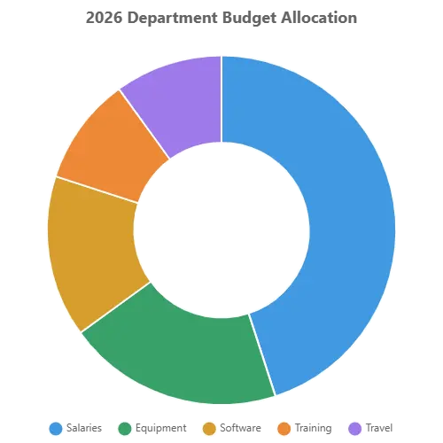
Let’s walk through creating a professional budget allocation pie chart using the tool.
Scenario: You need to present your department’s annual budget breakdown to stakeholders.
Step 1: Set the number of slices to 5 for five budget categories.
Step 2: Choose “Doughnut Chart” type for a modern, clean appearance.
Step 3: Select “Pastel Colors” scheme for a professional, non-aggressive look.
Step 4: Enter the chart title “2026 Department Budget Allocation”.
Step 5: Edit the slice labels and values in the Chart Data section:
| Category | Budget ($) | Percentage |
|---|---|---|
| Salaries | 450,000 | 45% |
| Equipment | 200,000 | 20% |
| Software | 150,000 | 15% |
| Training | 100,000 | 10% |
| Travel | 100,000 | 10% |
Step 6: Set border width to 2px for clean separation between slices.
Step 7: Position legend at the bottom for balanced composition.
Step 8: Click “Update Chart Preview” to render the chart.
Step 9: Export as PNG for inclusion in your budget presentation.
Result: A professional doughnut chart clearly showing that salaries consume nearly half the budget, with equipment as the second-largest category. The pastel colors are easy on the eyes while maintaining clear distinction between slices. Tooltips show both raw values and percentages when hovering.
Data Analysis:
Total budget: $1,000,000
Largest slice: Salaries (45%)
Smallest slices: Training and Travel (10% each)
The chart instantly communicates budget priorities to stakeholders.
A pie chart is a circular statistical graphic divided into slices to illustrate numerical proportions. Each slice’s arc length (and consequently its central angle and area) is proportional to the quantity it represents. Together, the slices form a complete circle representing 100% of the data. Pie charts are named for their resemblance to a pie that has been sliced into portions.
Intuitive Proportions: The human brain naturally understands parts of a whole. A pie chart transforms abstract percentages into visual slices that anyone can interpret instantly.
Quick Comparisons: At a glance, viewers can identify which categories are largest, which are smallest, and how categories compare to each other.
Part-to-Whole Relationships: Unlike bar charts that compare independent values, pie charts excel at showing how individual components contribute to a total.
Accessibility: Pie charts are universally recognized and require no specialized training to understand.
Memorable Visuals: The circular form with distinct colored slices creates memorable visual patterns that help audiences retain information.
Best Uses:
Showing proportions and percentages (data that sums to 100%)
Displaying 3–7 categories (beyond this, slices become too small)
Highlighting a dominant category (a “big slice” story)
Comparing parts of a whole (budget allocation, market share, survey responses)
Avoid When:
Comparing precise values (bar charts are better for exact comparisons)
Showing data over time (line charts show trends better)
Displaying many categories (more than 7 slices become cluttered)
Comparing multiple datasets (grouped bar charts work better)
Business and Finance:
Budget allocation by department
Revenue breakdown by product line
Expense categorization
Profit margin components
Investment portfolio diversification
Marketing:
Market share analysis
Campaign budget distribution
Customer demographic breakdowns
Channel attribution
Survey response proportions
Education and Research:
Survey result visualization
Demographic compositions
Resource allocation
Time distribution studies
Grade distribution analysis
Project Management:
Task completion status
Resource allocation by phase
Risk category distribution
Time tracking by activity
Budget utilization
Personal Finance:
Monthly expense categories
Savings allocation
Investment types
Debt composition
Income sources
Limit Slices: 3–7 slices is ideal. More than seven creates visual clutter and makes slices too small to distinguish. The tool limits slices to 12 maximum.
Order Slices Logically: Arrange slices from largest to smallest (clockwise) for easiest comparison. The tool displays slices in the order you enter them.
Use Contrasting Colors: Slices need distinct colors for easy differentiation. Color schemes provide harmonious, contrasting palettes.
Include Percentages: Showing percentages alongside or within slices helps viewers understand exact proportions. The tool displays percentages in the data cards and tooltips.
Label Clearly: Direct labeling (placing labels next to slices) is often clearer than legends, especially for charts with few slices. The tool offers legend position options.
Start at Top: Traditional pie charts begin with the largest slice at the 12 o’clock position and proceed clockwise. The tool follows this convention.
Consider Exploded Views: Pulling out one slice (exploding) highlights a specific category. The hover offset effect in the tool provides this interactivity.
Standard Pie Chart: The classic circular chart where every slice meets at the center.
Doughnut Chart: A pie chart with a hole in the center. The hollow space can display the total value or chart title. Often considered more modern and less visually heavy.
Polar Area Chart (also called Coxcomb or Rose Chart): Each category has an equal angle but the radius varies with value. Created by Florence Nightingale, useful when you want to emphasize magnitude differences while maintaining circular form.
Interactive Editing: Modify labels and values with real-time preview
Multiple Chart Types: Choose between pie, doughnut, and polar area formats
Automatic Percentages: Percentages calculate automatically as you edit values
Custom Color Schemes: Five built-in palettes plus individual slice color control
Live Statistics: View largest slice, smallest slice, and data range instantly
PNG Export: Download high-quality images for presentations and documents
CSV Export: Save your data with percentages for use in spreadsheets
Preset System: Save and load configurations for recurring projects
No Registration: Free to use with no account or email required
Mobile Responsive: Works on phones, tablets, and desktop computers
Keyboard Friendly: Enter key applies changes in input fields
Auto-Save Pending: Changes auto-apply after 2 seconds of inactivity
Tooltip Details: Hover over slices to see exact values and percentages
You can create between 3 and 12 slices. For readability, we recommend 3–7 slices for optimal visual clarity.
Percentages are automatically calculated by dividing each slice value by the total of all values and multiplying by 100. The tool updates percentages in real-time as you edit.
A doughnut chart has a hole in the center, making it look like a ring. This can be used to display the total value or simply for aesthetic preference.
A polar area chart has slices with equal angles but radii proportional to values. Each slice extends from the center outward based on its value, creating a flower-like appearance.
Click “Share Chart” to copy chart data to your clipboard or use your device’s share functionality. For visual sharing, export as PNG and share the image.
ADVERTISEMENT